


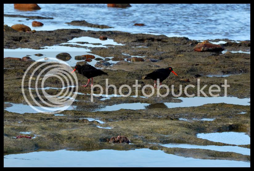
I think i'm going to use this thread to post all my random pics.....
Bike related or not...... don't look if you don't want too... :thumleft:
Guys with skill please criticize so i can learn.
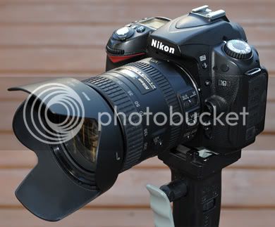
The Camera: Nikon D90 with 18 - 200mm Nikkor
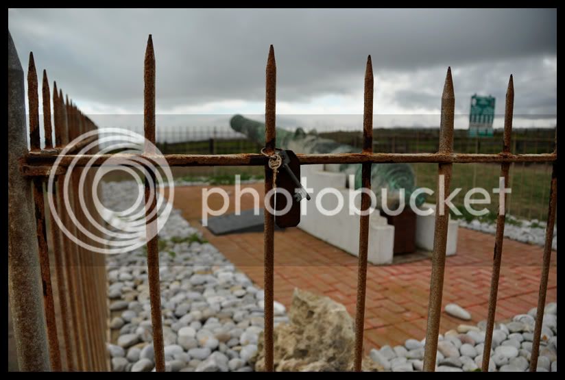
The old canon at Schoenmakerskop
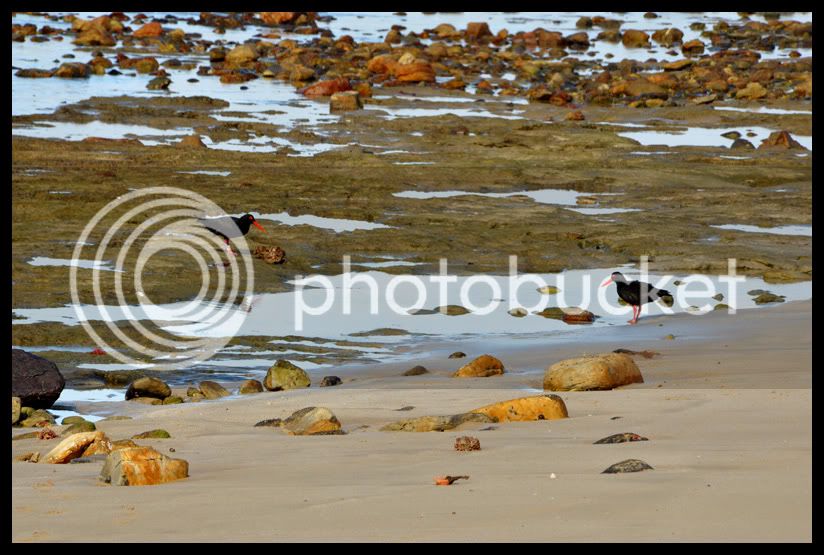
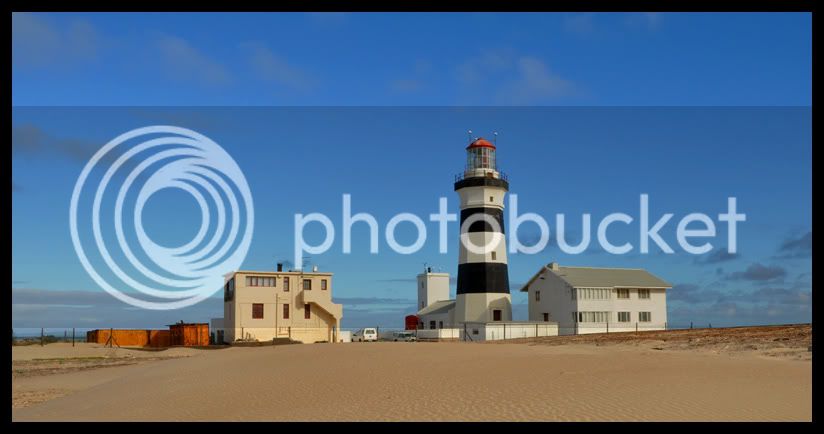
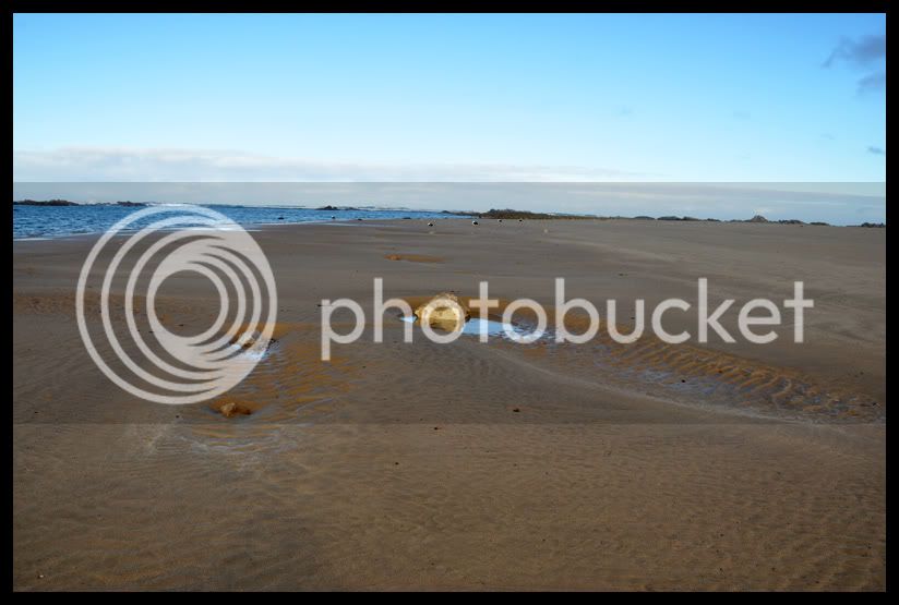
A few shots from the lighthouse
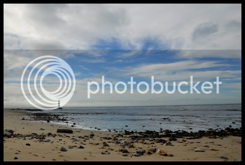
Cape Receive Lighthouse in PE
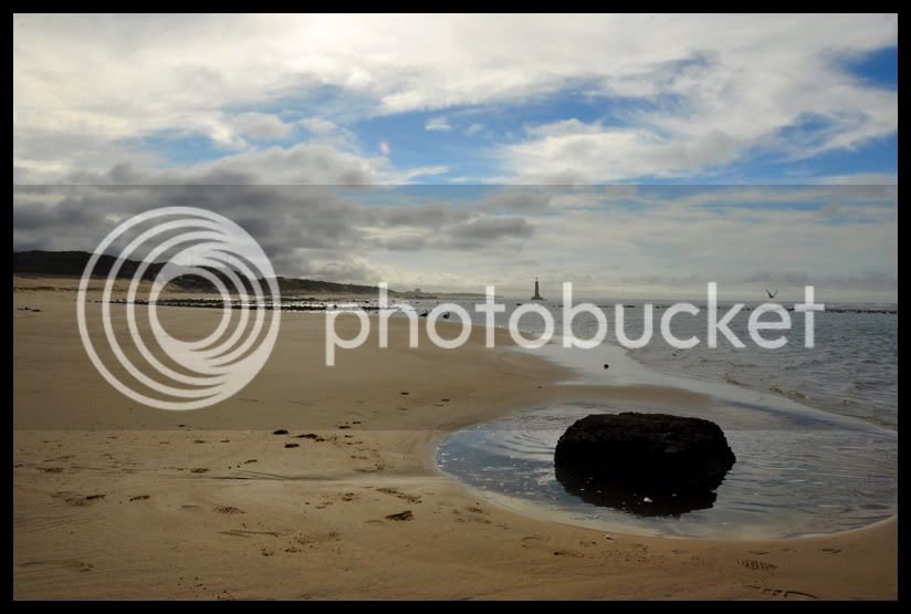
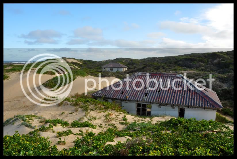
Old half broken down houses at the light house. Wonder what they were?
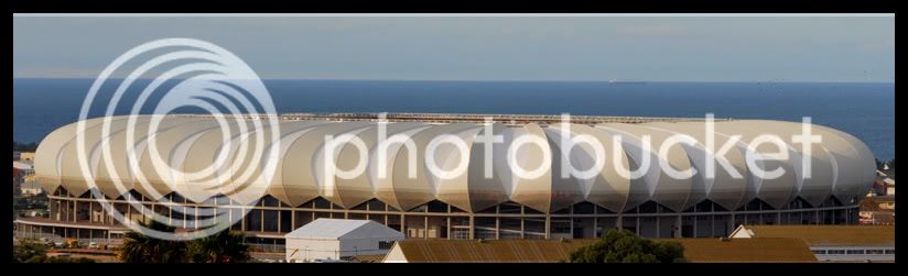
PE soccer stadium.
Bike related or not...... don't look if you don't want too... :thumleft:
Guys with skill please criticize so i can learn.
The Camera: Nikon D90 with 18 - 200mm Nikkor
The old canon at Schoenmakerskop
A few shots from the lighthouse
Cape Receive Lighthouse in PE
Old half broken down houses at the light house. Wonder what they were?
PE soccer stadium.